- industry
- location
- emotion
- discipline
501 Results
501 Results
How do you brand and take-to-market a cash gifting platform that mixes charitable donations and contemporary art, in a way that is both easy to understand and attractive to a digitally native audience?
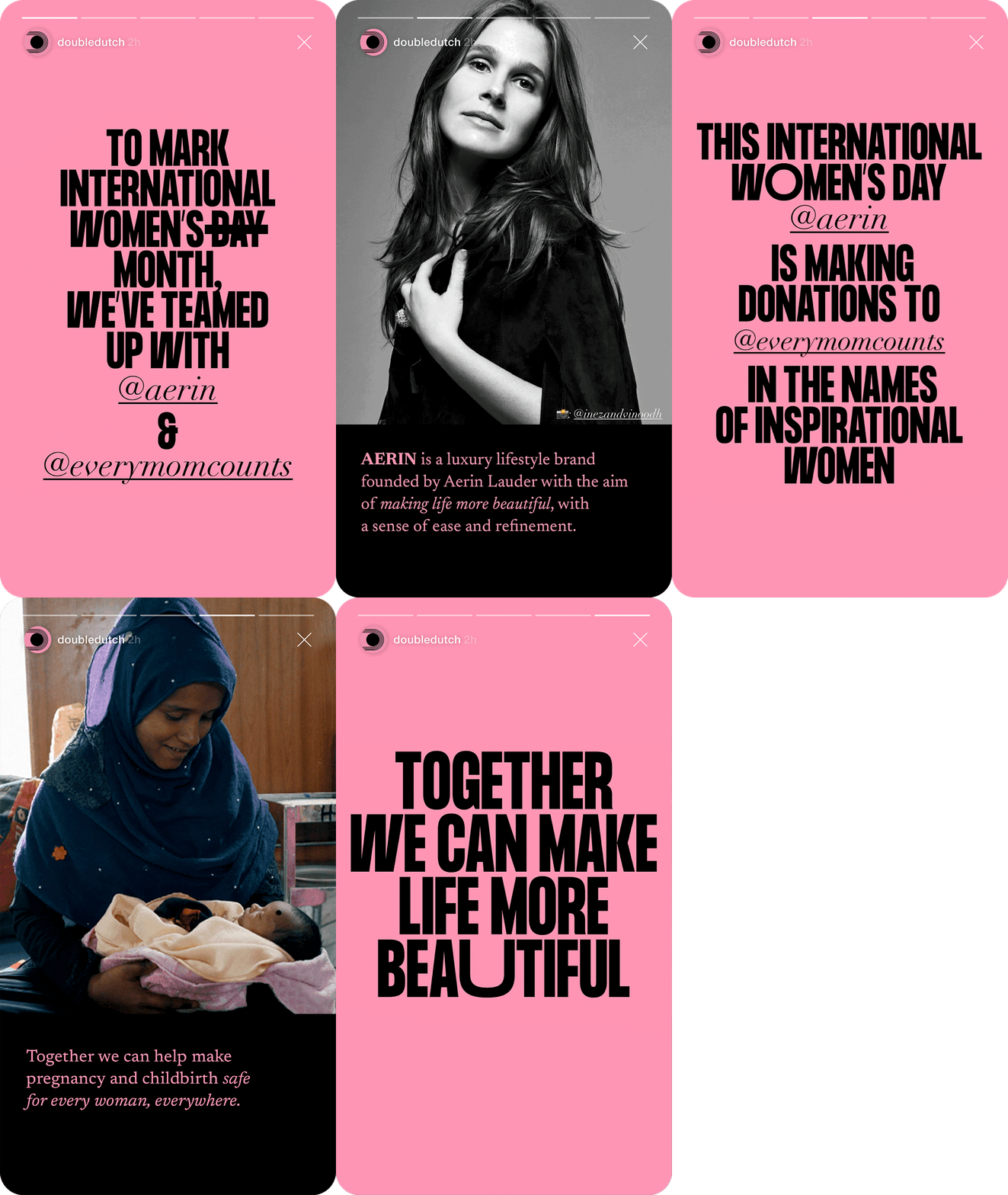
Put the work of the world-class artists centre stage, supported by playful animation, expressive typography, and a humorous, punk tone of voice to communicate strong cause-led messaging.
The name, Double Dutch, was inspired by the reciprocal jump rope game where players work together. This also influenced the logo.
KesselsKramer were involved from the brand’s inception, working to develop the initial strategy, naming, identity, and tone of voice, right through to the content, social strategy, and all brand communication.
Visit the platform here.
KesselsKramer invites you to
Have a similar project, problem or communication-need laying about? Would you like us to help? Or, simply like the look of our work and want to know more, get in contact below.


